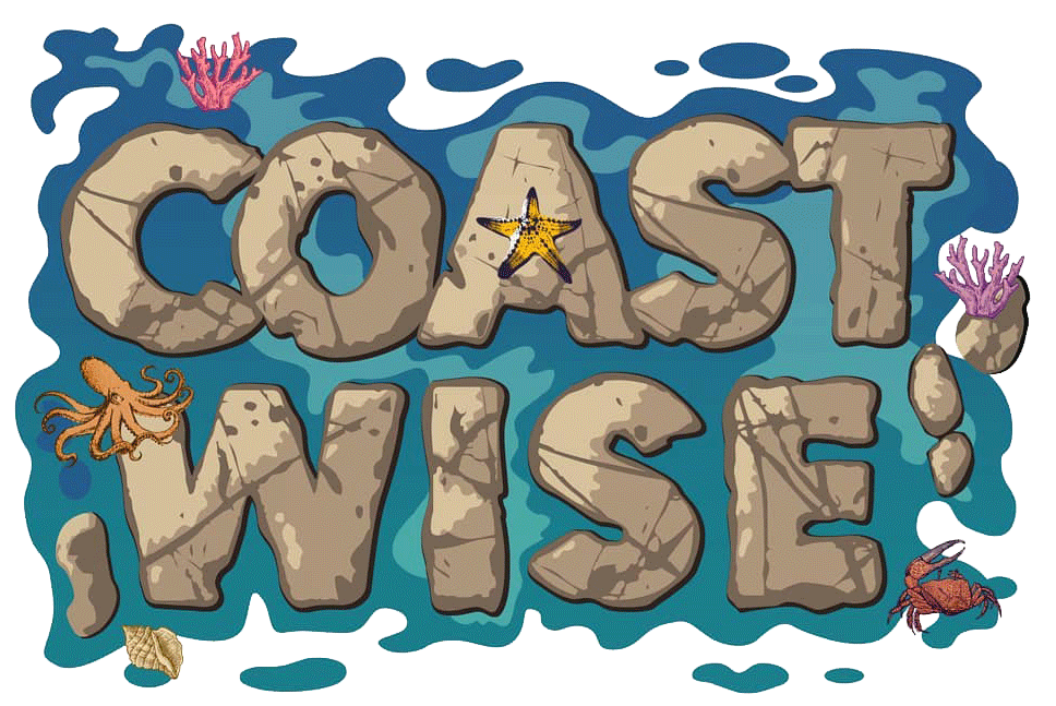
Coastwise Identity Design – The Story of a Logo


For an annual festival like Coastwise, it was vital to create brand recall value. We needed a strong identity, something that showcased what this festival had started to do.
We brought onboard a company called Visual Sarkasm, known for designing identity and brands. Their team members Rituparna Sarkar and Hitesh Sonar shaped Coastwise into its glorious logo by deep-diving into the science communication laid out by the team.
What arose from this was the logo: a simple idea that this is a habitat which is partially submerged by water. The typeface would be designed like rocks, with shimmering water lines around and one odd little creature (to add a pop of colour and an element of surprise).
We wanted each of our events to have one mural that showcased Coastwise in its different aspects.
We ensured all three murals pointed to different parts of the coast: tidepools, deep ocean, mudflats.
These were put at all our events and were very loved by our audiences.
Mural 1: A marine scape with the intertidal moving to the depths of the ocean.


Mural 2: A tidepool and all that it hosts.

Mural 3: Flamingos in the city, mudflats and the mangrove ecosystem.


